How we built our landing page in 3 days with Figma, Cursor, and Claude
A guide on how to use AI to amplify your taste, not replace it.

Ajay Sohmshetty
Your landing page is your company's first impression. It sets the tone for your entire brand, builds trust, and signals credibility before a visitor reads a single word of copy.
The last thing you want is for it to look cookie cutter, or worse, vibed. You know the tells: gradient backgrounds, neon accent colors, dark themed layouts. It screams "an AI made this and nobody reviewed it."
Here's the thing: AI gives us the ability to move incredibly fast. But when it comes to design (and especially your landing page), taste matters. So how do you combine the speed of AI with your own taste? How do you use AI to amplify your design sensibility rather than replace it, and without breaking the bank?
If you liked our landing page, read on. I'll share exactly how we built it behind the scenes in just 3 days, plus our learnings and recommendations so you can build your own beautiful landing page in no time.
The before and after
Before the refresh, our landing page looked like this (admittedly, vibed in a few hours):
After the refresh, here's what we have now:
A dramatic improvement. But it's not just about aesthetics. The new design has been a win for engagement and conversion too. According to our PostHog analytics, in the few weeks since the refresh we've seen:
- Dwell time (average session duration) up 42%
- CTA clicks up 66%
- Conversion up nearly 33%
- Signups per day up 39%
Clear proof of how much impact a well-designed landing page can have.
So what's the process?
Step 1: Mood board and wireframe in Excalidraw
Before starting on any designs, we brainstormed the overall layout and content by putting together a mood board.
For this we used Excalidraw, a tool I can't recommend enough. It's perfect for wireframing and brainstorming: a simple virtual whiteboard that gets out of your way.
The mood board
This is as straightforward as copy-pasting screenshots of landing page sections that you like.
Do a bit of research and find companies with great, modern branding that are adjacent or competitive to yours. Note the keywords great, modern branding. Many large incumbents have legacy-style branding that will make your landing page feel outdated. I wouldn't recommend using them as a guide.
To find inspiration, look through recent companies in the YC batch and lists like Harmonic Hot 25, or run some ChatGPT Deep Research queries. For instance, I asked ChatGPT to "find me the hottest email marketing AI native startups".
For us, as an AI marketing platform that runs on your database, we sit at the intersection of vibe coding and email. So our mood board included companies like:
- Vibe coding platforms: Lovable, Bolt, Figma Make
- Email platforms: Resend, Loops, MailChimp
- SaaS companies: Linear, Supabase, Vercel, Firecrawl, Searchable, Peec.AI
Observe how they speak to their audience. What kind of language do they use? What's their CTA? What's their hero section like? How many sections do they have and what's the rough layout and hierarchy?
You should be able to identify some meta trends and patterns. Discuss with your teammates and align on high-level aesthetic and design goals.
My recommendation: don't get too creative. We're optimizing for speed, so stick with what's tried and true and iterate later. We landed on:
- Light theme with orange accent color
- Modern, clean design with geometric shapes and minimalistic elements
- Better, more unique typography
At this point you should have a good enough sense to start wireframing.
Wireframes
We started with the navbar and hero section.
We took direct inspiration from our mood board. My recommendation: no need to reinvent the wheel. Pull a structure you like off the shelf and follow the patterns that successful companies are using.
In terms of copy, I find platitudes like "Transform your business" or "Say more, powerfully" to be marketing fluff and just distracting. For your hero section, be direct and focus on the core value proposition of your product.
For Dreamlit, that's being the easiest way to send emails with AI. We wanted to highlight that, along with our unique database-driven approach (no app code integration required). We landed on the tagline AI Marketing Platform that runs on your database, with the subtext: "Every email your app sends. Transactional, marketing, lifecycle. One platform, for the agentic era."
Once you're happy with the hero, continue with the rest of the sections to tell the story of your product. This includes how it works, features, pricing, integrations, use cases, FAQs, testimonials, and a closing CTA.
Our wireframes in Excalidraw:
This may look like a lot, but it's not much more than an afternoon's worth of work. Remember, no need to draw it to pixel perfection or scale, and we're not reinventing the wheel here. Excalidraw does a great job of getting out of the way so you can materialize your ideas quickly on the virtual canvas and you can take direct inspiration from other designs you like.
Step 2: Decide on typography and overall look and feel in Figma
At this point we had a good sense of the overall layout and content. We then began fleshing out the actual design, starting with typography and overall look and feel.
You want to establish the baseline aesthetic before designing the full page. Once you nail this, the rest of the sections become straightforward to implement given the aesthetic and copy you've already locked down.
I recommend hiring a professional designer for at least this part. You can find designers on freelance platforms like Upwork. Look at their portfolio and see if their style matches what you're going for.
Tell them to put together just the navbar and hero section. Align on the overall look and feel before moving on.
This shouldn't take a seasoned designer more than a few hours.
Iterate with the designer on:
- Typography: Font choices, sizes, weights
- Look and feel: Background, colors, spacing
- Visualizations: At least positioning and placeholders
Use an established design system like ShadCN or Tailwind CSS and reuse basic components.
I don't recommend doing this part yourself without a designer, unless you have the time and design expertise. It'll take you longer to get it right and the proportions will be hard to nail. Plus, once you have the designer onboard, fleshing out the rest of the page is just greenlighting them to apply the established aesthetic to the remaining wireframes.
Step 3: Flesh out the rest of the designs in Figma
Once we aligned on the overall look and feel, we greenlighted the designer to flesh out the rest of the designs based on the wireframes from Excalidraw.
For visualizations and graphics, we sketched those out at a high level to give clear direction.
It shouldn't take more than a day or two for the designer to come back with the designs, and it shouldn't require too many rounds of feedback given the clarity of direction at this point.
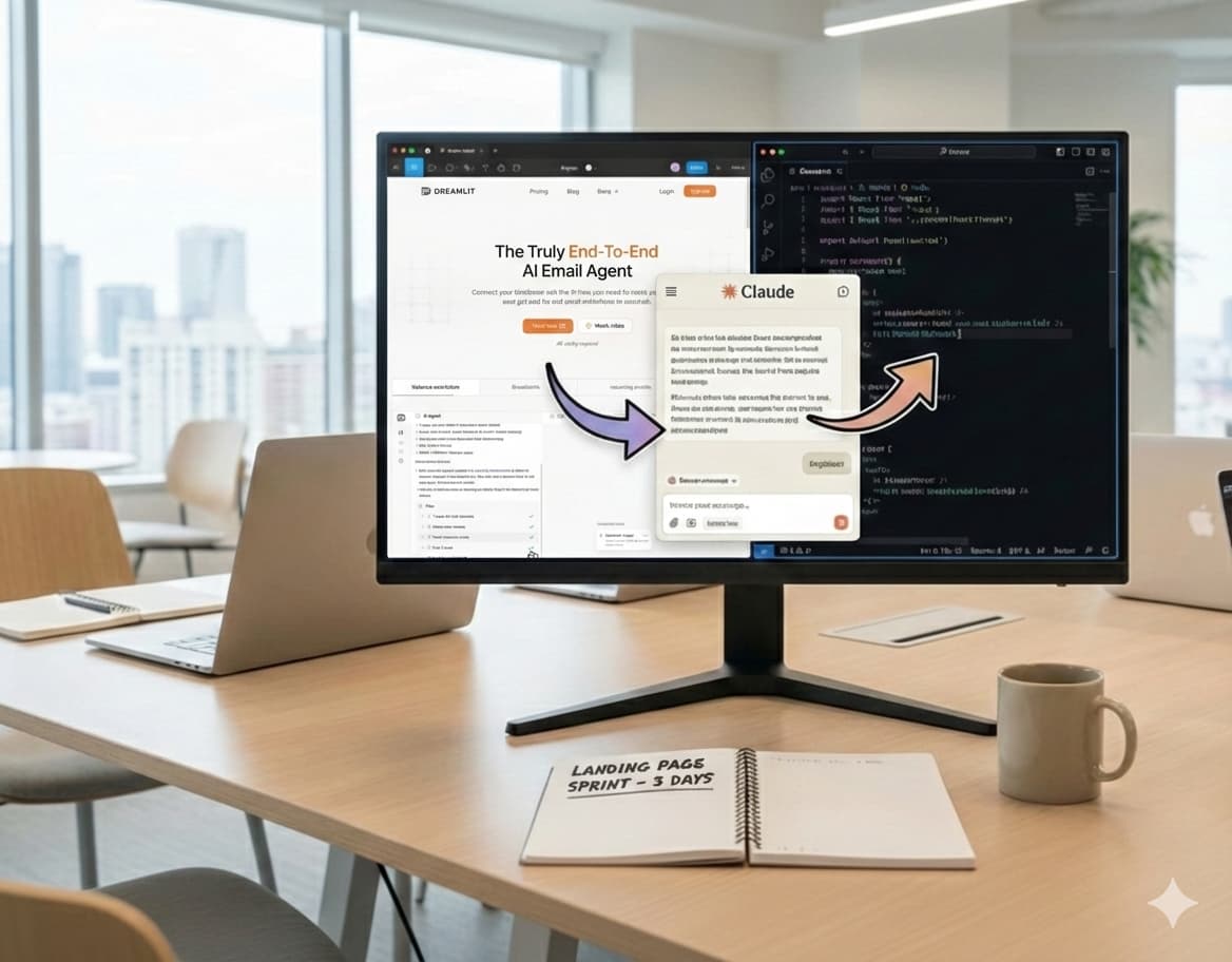
Step 4: Use Cursor with Opus to implement Figma designs in code
Believe it or not, this is the easy part thanks to AI.
Once you have the designs in Figma, you can point Cursor at them and tell it to implement. It won't be perfect, but it should get you 90% of the way there on the first pass.
To set up:
Then in Figma, select the section you want to implement, right-click, and under "Copy/Paste as" select "Copy link to selection" (or hit CMD+L).
Paste that link into Cursor and tell it to pull the Figma design and implement it.
Start with the scaffolding: navbar, typography, layout. Then implement section by section, starting with the hero.
In our experience, Claude Opus 4.6 has a slight edge over GPT 5.3/5.2 in Cursor for implementing Figma designs, but both are great. Try both and see which works best for you.
Final checklist:
- Animations: Add interactive components with Framer Motion
- Responsive design: Make sure everything is mobile-friendly
All of this can be done by prompting the LLM, observing the results, and iterating.
Conclusion
The key takeaway is this: use AI to amplify your taste, not replace it.
AI is incredible at accelerating execution. It can turn a Figma design into working code in minutes, iterate on copy, and handle the tedious parts of building a landing page. But it can't replace the human judgment that makes design feel intentional, cohesive, and trustworthy- i.e. your taste.
Here's the process in a nutshell:
- Mood board and wireframe in Excalidraw to align on aesthetics and layout
- Nail the typography and look with a professional designer in Figma
- Flesh out the full designs by applying the established aesthetic to your wireframes
- Implement with AI using Cursor and the Figma MCP to go from design to code fast
The whole process took us 3 days and the results speak for themselves: 42% more dwell time, 66% more CTA clicks, and 33% higher conversion.
Your landing page is too important to leave entirely to AI, and too costly to spend weeks hand-coding from scratch. This approach gives you the best of both worlds: professional design quality at startup speed. Give it a try, and if you build something great, we'd love to see it.
About the Author
Co-Founder
Ajay is CEO and Co-Founder of Dreamlit AI. His job is to get Dreamlit in front of the businesses that need it and to make sure the company scales in a way that actually works. Full bio →
Other articles

10 Best Managed Postgres Providers Compared (2026)
The 10 best managed Postgres providers in 2026, compared on pricing, SLA, failover, and real Postgres compatibility.
Thinking in Database-Driven Notifications
What are database-driven notifications and how do they matter?